Showing posts with label Art Reviews. Show all posts

Sunday, March 2, 2008

POP ART: ROY LICHTENSTEIN IS NOW!


POP ART: ROY LICHTENSTEIN IS NOW! By John G. Kays First Edition

*(Note: I keep saying to myself that I will rewrite this piece & make it better. I never seem to get around to doing that, so i`ll just give it to you in its lumpy state.)

'The insistent dramas of love and war interest Lichtenstein less than ‘the formal problem…Once I`ve established what the subject matter is going to be, I`m not interested in that…I think of it as abstract painting when I do it .Half the time they`re upside-down anyway when I work’. Most Pop Art is essentially emblematic in its conjunction of word and image. Lichtenstein shares with ‘post-painterly abstraction’ his enlarged scale, broad flat forms on colour fields, carefully depersonalized line, reductive composition, and expanded forms that seem to exist beyond the framing edge.' Pop Art-page 125-Lucy R. Lippard

I like to walk around the Austin Museum of Art fairly quickly and glance at all of the prints in order to get a pristine impression. I love the Lightning Bolt Banner Felt from 1966 and the Explosion from the portfolio lithograph from 1967.Lichtenstein was daring, innovative and defiant. He is seemingly anti-intellectual, cartoon-like, but at second glance reshaping images from the past to ‘something new!’ How can a catalog image be so unusual…Seven Apple woodcut Series simple and fresh. Apple and Lemon looks real as if you could eat it. Pyramids from 1969 an Egyptian lithograph clear and direct. Cathedral and Haystack Series laughs in the face of Monet…Seuratesque and yet not. Modern Head series from 1970 gets more and more abstract….

The American Experience through Roy Lichtenstein is an intensively narcissistic voyage ; he takes you on a winding boat ride past the collective ephemera of Americana; it is shimmering like a lit-up, neon-glowing Times Square on New Years Eve! Roy invented Pop Art, perhaps subconsciously, in concert with several other likely heroes, traditional listings include: Andy Warhol,
Tom Wesselmann, and Claes Oldenburg. He attempted something novel and fresh and invented new techniques of expression by combining alternative printing media; he defied the ISMs but was studied in the printing craft and practiced the wisdom of ‘know thy enemy.’ The processes of printing confidently defines the content; I can only intuit this not prove it, although here is some reinforcement. ‘Everyone had to agree with Greenberg when he declared that “Picasso, Braque, Mondrian, Miro, Kandinsky, Brancusi, even Klee, Matisse and Cezanne, derive their chief inspiration from the medium they work in. The excitement of their art seems to lie most of all in its pure preoccupation with the invention and arrangement of spaces, surfaces, shapes, colors, etc., to the exclusion of whatever is not necessarily implicated in these factors”.- Pop Art by KlausHonnef-page 14. An element of mechanization existed in this new form and the idealism of Abstract Expressionism was abandoned. Content, per se, was secondary for Pop Art, but in the context of the 1960s the popular masses freely contrived meaning and/or symbolism within its frames. Ironically, these artists picked the most prosaic of materials, brillo boxes come to mind, then the audience sublimated these items as icons worthy of worship; this indulgence was unbeknoweth to Roy and Andy and Tom. The masses longed to glorify secular images, suc h as Chairman Mao, Elvis, or Liz Taylor for no particular reason other than their sheer elusive star magnetism or lack of it. This carried over in Pop Music where people would see extraordinary meaning in lyrics-you may remember the controversy surrounding the Kingsmen`s smash hit Louis Louis. The popularity of Pop Art is hard to explain, but perhaps people needed a sensational relief from monotony of daily life.

Still colliding downward from the happening of Pop Art…churnin` & yearnin`, yawnin` & dawnin`, rippin` & trippin`, thinking` & blinkin` Lincoln…where did you go Peter Blake?. Feel the energy rushing to my toes! Bought the lumber, picked up the art catalog, photographed the Roy prints, had visions of its outcome, went to Walgreens and created 25 pristine prints, trimmed and mounted them on maple, used about half a tube of 16 ounce Elmer`s, stirred two tubs of acrylic latex paint, one deep blue, the other off yellow, then used a stick and dripped oodles of pain-paint, undulating randomly, on the wood plate, glued two Andy Warhol refrigerator magnets on the surface, glued three randomly self-made Roy snaps on afterwards, including my favorite of Chairman Mao (an evil tyrant), tossed it right in the center…Will touch it up with acrylic paint dabbles and will call it a day. Purchased a two-inch stencil at the Hobby Lobby and plastered the logo to the top of the wood. Pop Art is now, wow, cow, unplanned, nerve-taxing, spiritual, a dichotomy of plagiarism and spontaneity, reaching for the stars but not getting there, pretty paper with poetry & pomp or circumstance, pusillanimous pussyfooters puffy and percolating… no-wheres-ville that is sparkling and catchy, will make you famous, will make you rich, will titillate the crowds, shown in the street galleries, forever young and alive! Good lovin`, goodness gracious great balls of fire, great Caesar`s ghost, and the Virgin of the Guadalupe, all in one bundle, visits us daily! Need to meltdown from pungent AGED SUMATRA Lingtong Peaberry Blue Batak bean soon! Let go, uptight out of sight, chitty chitty bang bang, coffee beans roll across your taste buds and paint pours on cloth in random patterns of crystal clear inspiration…huh!! What! Who says! Will beaucoup layer-cake `til the end of time! Blue Meanies yank you away to concentration camps for the incorrigible IF kids…which is just about anyone who likes to be free…see what I mean, I am paranoid `cuz the ‘American Dream’ is in peril, and I don`t want to be swept away in a maelstrom ….I like the world of the early sixties and try to remain there. Read this and be free. Free you, free me…censorship is not to be! Okay…I got a little carried away, this is not journalism. Maybe I will be more analytical tomorrow…but who really is going to care? Final product Luv Pop Art and rocks your world my pretty?

Moonscape (from 11 Pop Artists, Vol I), 1965 is an early screenprint that is dreamy and very blue and suggests a romantic, untamed world where the universe is in fluctuation, with undulating plasmas and gases in motion. Things are a bit balmy like a London fog o`er the Thames or a perfect storm brewing in the Florida Keyes. Van Gogh`s Starry Night surfaces, but this is more of an earth science thing that includes bubbling lava and some cacophonous skies of an angry Zeus spitting out torrent- pellet moisture in an isolated speck of the shoreline…in no particular point on the globe. I walked by it several times and returned with glee, but was shrouded with blues and raw energy, primordial feelings of forlornness and misgiving. This work led to Lichenstein`s tendency to publish whole portfolios of prints that would be one continuous series, that show the stages of the process. His model here is the Impressionist master Claude Monet, who liked to capture on canvas different measures of daylight reflecting on, say a cathedral or a haystack. Roy too alters common images through synthetic stages that mutate a popular icon a million-fold until it becomes a rather transformed creature. Like the Warhol Marilyns, it becomes its own object of worship. For me, this is the way that matter decomposes and changes in a possibly scientific and/or historical fashion, sometimes organic and often man-made. I do not need to know every nuance of Roy`s method to see what he is up to. Roy disguises plagiarism through crafty mutations that alter popular cartoon graphics and catalog snaps into new being; he does it with humor and panache extraordinary! He is the most original plagiarist ever, an oxymoron that works for him!

‘One two three four five six seven, all good children go to heaven. One two three four five six seven, all good children go to heaven. Pop anthems come from Pop art too. Batman lunch kits and cape crusaders costumes adorn my collection. Pop art entertains, it cajoles, it caresses, it flirts with the icons of posterity, it teases and pleases…sends us skyward, we`re Superman flying through outer space on his way to nowhere? Borrows from want ads, purloins sneakily from magazines, mocks the Abstract Expressions who mock the Impressionists…Pop! Bam! Zapp! Whish! You are in the Now, the in-crowd of the cow! Lucy Lippard is evangelical art critic for Pop art…her 1966 book Pop Art a dictionary of definition for me. The eyes are assaulted with absurdity. Rhythms are broken, calculus comes in play, an` extra texture is all around. Andy loves cows, Roy loves cows. Anti-war message in the blast of bombs! Brushstrokes are the DNA of an artist.

Paintings Series: Two Paintings: Beach Ball, 1984 catches the eye then tosses it to some giggling zephyrs blowing confusion boats pall mall to distant lands. The top image is an anti-cubist girl, the remnants of an earlier cartoon girl, possibly the one Girl With Ball, 1961, that launched Roy Lichtenstein to fame. I have been fond of this one for years, and use the postcard as a bookmarker. In Pop Art by Lucy Lippard, a very helpful primer on this subject, you can see the clipping from the resort section of the Sunday New York Times, 1963, where Roy got his idea for Girl With Ball. In the 1984 version she is abstract and resembles a Picasso, but the beach ball is recognizable and the frame is prominent bordered by diagonal lines that are reflected within the frame as well. The frame is part of the total work; it is as if we are staring at two painting in an arbitrary gallery, and our imperfect eyes can only see two portions of the respective pieces; the subjectivity of viewing art is suggested as a twist of larkish lime.

‘In Lichtenstein the prosaic becomes the profound; that is. there is no message, just a visual image to latch on to. There is no message in a bottle, no metaphor, no symbol, just a fun little construction project. Is there some subliminal voice beaming from the canvas?…no! The images are not real…the Rouen Cathedral has been done before…the Haystack Series has been done before…the bulls get more and more abstract…the Pyramids are not from the Old Kingdom…no real human being lives in the Interior Series… the couches are unreal, the lamps are mirages from an Industrial catalog…the painting fakes…the reflections in the mirror illusions of the mind…why does Roy make these prints? Because THAT IS WHY HE IS ON THIS EARTH!’

Reflections Series: Reflections on Conversation, 1990 uses a number of printing modes, including lithograph, screenprint, woodcut, and metalized PVC collage with embossing. The signature Benday dot pattern is employed as well. Just how Roy combined these media remains a mystery for mr presently. The observer is peeping into a room where a couple is talking, possibly through Venetian blinds, so there is an element of scandal or compromise. That is, we feel particularly guilty, because we are intruders to the singular intimacy that prevails. I immediately thought of the movie The Conversation with Gene Hackman, and directed by Francis Ford Coppola, that expresses the paranoia of electronic surveillance via the Watergate scandal of that time. We feel guilty because we are doing something that we should not be doing; we are Peeping Toms to a piece of art, now isn`t that funny? The Reflections Series has been portrayed as a narcissistic indulgence where Roy and the viewer are misremembering his early cartoon pieces. In this light, we are looking into the past, and maybe experiencing a dialogue about art and hence where one may travail in the bigger picture of things. One interpretation is that we are looking into a window of the past and witnessing the actual finalized plans for Art and its history! It is an inside joke for those that are on a pedestal, such as the New York school.

Cubist Cello, 1997 is just a screenprint and this is print 41 of an edition of 75; sure wish I owned one! This would come in the same year that Roy died, and so evokes a stack of experience and expression, a crescendo to a fruitful career in print production. It take the shape of a collage with profiles of a woman, a musician, a bird, and a cow, all staring in disparate directions, all unaware of each other, yet they miraculously impersonate an oddball ensemble…a platoon of hummingbird harmony. There is an abundance of balance here, the lines define simple objects in space, the dots and stripes are measured out in equal quantities, and the colors are simple yet faded, but the lines are sharp and suggest separate planes in space. The question arises: why are animals and musicians together here? The answer is for NO real reason at all. The cello instrument presides right in the center, and a portion of a flute player occupies the lower left-hand corner. The cellist with the marine-blue cap strikes the strings with bow while the merry flutist blows melody into the pipes. It is anti-cubist, anti-Picasso…but pays tribute with irony and gusto to that school of art. Its narcissism to the history of art is pungent, yet it`s delicate and catchy, defiant and funny, teeming with tones and geometric fragments…melodies and pastels sing out against colliding mathematical design, shades of earthen brown and grays, the lightest of yellows. Benday dots, bars and stripes…contours of mental memories; the band plays on. The Andantino of Symphony No. 3 by Aaron Copland is piping in my ears as I drink the cello print and remember its placement on the wall at the Austin Museum of Art. The composition is sound and classic, centered and serene; its methods are both in check with the ISMs of art school and in defiance towards them, a rejection of the past yet a winking to its inkings!

There`s a black hole in my soul but Roy makes it better. I`m supposed to report to Mr. Bellamy, I wonder what he`s like. Pop art is just intended to titillate, nectar for the eye…please enjoy my Luv Pop Art, I can do it too. Just innocence, a narcotic effect. Buy American People!

Saturday, June 23, 2007

LANDFILL OMEGA


All my life I`ve had my hands on bits and pieces of funny trifles,...miniscule thing-a-ma-giggies or scraps of ephemera that I sometimes have considered as art-but what I really mean-is rather simple products of everyday life-odds and ends that are usually only scrutinized by garbologists (you may want to hum "Fresh Garbage" by Spirit here). With "Landfill Omega" I decided to get my ya-yas out and create a collage with a wide variety of media. In this one I used oil paints, acrylic paints, photographs, xeroxes, molding paste, interior flat wall paint, movie ticket stubs, and film negatives. I thought of the concept while I was taking a shower one morn, and thus I fancied it would be a Neo-Platonic expression of perfection, GOOD ideals that exist dormantly in the Solar Plexis. The ideals that I chose were: PEACE, HARMONY, NON-VIOLENCE, BENEVOLENCE, IMAGINE, & SOLAR-LOVE. I had been reading about the Egyptian Pharoah Akhenaten and his non-traditional worship of the sun. This appealed to me, and I decided to create a cosmos with a Sun God in the center, and all of the other perfections radiating outward, and flinging their spendour throughout my personal synthetic universe. I was also thinking of the Beatles` song "Here Comes the Sun King"...yea that was cascading through my mind!


This shot above is simply the center of the work. I painted a small Greek God for the central portrait. The large acrylic rays project out from the center, beaming the ideals down on ye sinful mortals in an effort to cleanse y`all of fatal flaws, such as: WAR, VIOLENCE, HATRED, JEALOUSY ETC...Not a bad idea in a more perfect world! There are flourishes of house paint done in a Jackson Pollack technique of random droplets of paint or color flecks flung about whimsically. Just below LOVE is a photo of a work by Violet (I lost track of her a few years back), who paints within the Futuristic School, by my way of thinking, where globs of paint hold pulsating energy, or spiritually charged ions of energy, that radiate forth into the atmosphere, and electrify you just like a battery charger will revivify a cheap cell phone. To the top is a photo of some masks that I shot at the cactus nursery, The Living desert, that I go to frequently out by Lake Travis. I can gain more creativity in a couple of hours, when I go there, than I can obtain in a lifetime at my microscopic downtown condo! And by the way, the bars are piled with paint, in order to emphasize the intensity of the solar rays that project the ideals. On the right is a negative film strip. The colors are bright, intense, even psychedelic-but this was purposely done to draw your attention to the ideals, which have been buried `neath some cobwebs of propaganda by the Current Regime (see The Children of Men again to get the right feel of my message here).


Above is more the top of the painting. It has the two movie ticket stubs of Slither and The DaVinci Code, so it was about a year ago that I was working on this baby. There are two Mona Lisa images to the top and also two Quadrafoils. I got this idea when I read an interesting NY Times piece in the Science Times section that is published on Tuesdays. John Noble Wilford had written a piece about the Mayans and Quadrafoils had been discussed as a symbol that represented the Mayan Cosmos; anyway, I figured that if it was good enough for the Mayans, then it was fine for Bovee! For the title of landfill it is pretty obvious, as that is where we as a society dump everything that we do not want. This is also what I did, and stuck all the disposable junk, that was hangin` `bout my pad, on the canvas to create a piece of catch-all art, or maybe scrap-yard-art might apply. I suppose this is Freudian in a way, with beaucoup fallic symbols tossed in, but this is the good subconscious, the white witch of the mind. For omega it is a: subatomic particle in the baryon family having a mass 3,276 times that of the electron, a negative electric charge, ...a yea...that is what I meant...or maybe it is a reference to a fraternity house such as in Animal House.


This is the bottom section above, and it has two more Quadrafoils, two more Mona Lisa`s, a photo of my work L, a snap of me, and two images of Andre The Giant. I included him because he is in a lot of street art around here and he seems to represent something important, but I don`t know exactly what that is? I saw him once in Dallas at the Sportatorium, and he leaves a permanent imprint on your brain, as if you have seen Goliath hisself from the Olde Testament!

III

No voice from some sublimer world hath ever

To sage or poet these responses given-

Therefore the names of Demon, Ghost, and Heaven,

Remain the records of their vain endeavor,

Frail spells-whose uttered charm might not avail to sever,

From all we hear and all we see,

Doubt, chance and mutability.

Thy light alone-like mist o`er mountain driven,

Or music by the night-wind sent

Through strings of some still instrument,

Or moonlight on a midnight stream,

Gives grace and truth to life`s unquiet dream.

HYMN TO INTELLECTUAL BEAUTY-PERCY BYSSHE SHELLEY

Wednesday, June 13, 2007

A Welcome Visitor To Texas-The Dahesh Museum!

The exhibition at the Blanton, A Century of Grace: 19th-Century Masterworks from the Dahesh Museum of Art, New York, really filled up a black hole that has existed in my art education for some time. The question is: why did the Impressionists rebel so vehemently against academic art? Some of the answers to that question are contained in this humble show of about 50 paintings, prints, and sculpture from the Dahesh Museum in New York. I mean in his day, Jean-Leon Gerome was a big star, but now we mock his works, flog him with a whip for his feelingless brushstrokes and their lack of realism. Was he pulling the wool over our eyes with all of his pretty pictures? "Aint true", said the little red hen, who realized that he thought he was doing the right thing!

You can walk through the exhibit in about an hour, and even still look at all the works thoughtfully. I took a break on one of the fancy benches, and also picked up a couple postcards from the Dahesh Collection at the Blanton Lilliputian giftshop. I then went back around the show again, and took a few notes with the teeny pencil donated by the Blanton Team Member. I would drink each painting up for five intense seconds, sucking in the colors and forms, medium or theme meticulously. Then when I walked away, I shut my eyes, and conjured the image back to life on my cerebral desktop, and so long as it uploaded, I fancied I had total recall. In this way I was enabled to write about it afterwards, with some clarity. Then I would completely forget about it until the next morning, then after drinking beaucoup java, I shut my eyes pensively, and then would see if a slideshow of the opi reappears. It did in this case, so case closed!

As you walk around the square room the walls or panels are a rich blue against alternating ones of a lighter blue. There are many large background placards that explain important topics such as the Academie des Beaux arts, Orientalism, or the large timelines of political and cultural milestones of the 19th century. The former did much to keep things in perspective for me, such as the French Revolution, the Commune of 1871, the Franco-Prussian War etc... I realized that these events were altering the thinking in Europe, and that different camps of artists were starting to crop up in reaction to the turbulent events of the day.

My favorite piece was Lord Frederic Leighton`s Study for "Captive Andromache", a depiction of Hector from Book Four of the Illiad, imagining the fate of his wife Andromache, who stoops to drawing her own water. This is mainly a color study, and the blues, pinks, ochres, and whites really spring out and dazzle the eye. I haven`t seen the major work, but this one had a most sweeping impact on me.


Moses before the Pharoah 1883-Paris, by Gustave Dore was done in charcoal, pen, and ink wash on paper. The placard says that it influenced early cinematographers; I was seeing Cecil B. DeMille as I contemplated it. Dore`s illustrations of Dante`s "Inferno" are some of my favorites! Right next to it was The Massacre of the Innocents by Dore as well and this pen and ink cast its spell over me magically. The only actual painting by Dore was The Black Eagle of Prussia, 1871, and it fares from the Symbolist School. Since Dore illustrated a lot of poetry, such as The Rime of the Ancient Mariner by Colleridge, this is not surprising. You may want to pick up "Symbolist Art" by Edward Lucie-Smith, one of my favorite writers of art history. In the same camp, and seeming to simulate the work of William Blake, this striking pencil and watercolor titled: Influences, 1904 by Henry John Stock takes me to the place of fantasy.


This is LeGouter (The Snack), 1885 by Jules Breton and is a most cute and simple little oil. It was included in a petite section that had more to do with common people (people-ie); okay, actual French peasants. Hey, this truly gives off an Impressionist vibration or perhaps a Pissarro vibe. The colors are vaguer and more smudgy! Oh, a principle vein of this show is the depiction of the human body, both male and female. This is idle, bucolic fodder, but lovely nonetheless. Joseph Bail`s Un letter de son pere, 1921 was adjacent, and seems to render the struggle over Algiers in the background, a topic that has captivated me over the past year.

Jean-Leon Gerome probably has the most important pieces to the history of art in the exhibition. He was the most literal practitioner of Academy values. Le Travail du marbre or L`Artiste sculptant Tanagra, 1890 (below) shows his sterile use of color, a very stiff marble, and a self-portrait of the bland artist practicing his trade. No wonder Courbet, Degas, Renoir, and Monet were down on his case. His paintings project photographic precision, and were the popular gems of their day, but now are objects of contempt for the apparent suppression of feeling or obvious lack of naturalism. You feel nothing when you stare at his work! You sense that everything has been arranged to hide something else that may be important.

Orientialism played a major role in much of the academic art that is included in this amazing exhibition of the Dahesh Museum. This trend was especially present in the work of Lawrence Alma Tadema with his piece Joseph, Overseer of Pharaoh`s Granaries, 1874. The detail is particular enough that you feel as if you were actually with the granary keeper, although this happened more than 3000 years ago. Aye, I gazed at this one quite a while in awe! Too, look at The Egyptian Chess Player, 1865 on this link to see a similar work to the one that I saw by Lawrence Alma Tadema. Some of the aspects of Orientalism, albeit negative, were to portray the orient as exotic and even erotic, with harems available for the male hierarchies` pleasure. This was all propaganda on the part of the French government and had an obvious imperialist and even rascist component to it. You may want to probe the issue of Orientalism a little further, because it is a very interesting phenomenon. Look at the Women of Algiers carefully on this Wiki page! One other artist that reflected this trend was Henri Regnault and his work A Toreador, 1869 that shows a Spaniard with fulsome swaggart as a bullfighter. There is something very staged about some of these works? Yea, there seems to be a lack of sincerity to many of these paintings.
Jules Dalou (1838-1902) had two bronzes to view, one was the Bather, 1901 and the other was The Punishment, around 1885, and I detected some influence from Degas on the Bather. Dalou was involved in the Paris Commune of 1871, and had to flee from Paris after the mini-revolution collapsed. More baroque in style were two bronzes by Antoine-Louis Barye (1796-1875) from Paris. Lion and Serpent, 1833 was luxurious and could adorn my condo with domestic panache! Again, I could detect the safe qualities of his work, calling to mind the Ecole des Beaux-Arts or the fluffy grandeur of Academic Art. Be sure to look at The Birth of Venus on the Wiki page, because that one was in the show. It is actually a copy of Alexandre Cabanel by Adolphe Jourdan and has the pillowy splendour of Versailles under Louis XIV, but was done in 1864.
The thing that I take away from this show, is that the Impressionist break from the Academy wasn`t as drastic as it was claimed to be by Art History teachers, who I got my ideas from early on. Orientalism, for example, continued on with say Renoir. Yes, there were many changes in reaction to the stiff and somewhat unnatural predilections, of say genre painting. The amazing thing is that I have never seen in person what they were so stirred up about. Now I know when I stare at Gerome, what it is all about!
Just a small plug for my piece on "The Seventh Seal". It is featured on News Blaze and seems to be getting read quite a bit. Also, my Best of 2006 can still be read there. I had emailed Judyth Piazza back in February to read my review of "The Quiet", because she had reviewed it and it was on Rotten Tomatoes. We must have been the only people who saw that quirky film. She manages News Blaze along with the Student Operated Press, and they give opportunity to novice writers to get published on the Internet. I am very thankful for this outlet.

Sunday, June 10, 2007

Century of Grace-A Simple Sneak !

This single image is Michelangelo by Jean-Leon Gerome from the art show that I attended yesterday at The Blanton, now the Louvre of the Lone Star State. A pupil is showing the Belvedere Torso to the Godfather of Renaissance art. The exhibition`s title is: A Century of Grace: 19th-Century Masterworks from the Dahesh Museum of Art, New York. The Dahesh collects academic art, such as many of the drab paintings of the Academie des beaux-arts. This is the variety that I`ve read about, studied in school, but have never witnessed in person. The larger modern public has never seen these varieties, it is of little interest to most; `tis the barren school of stuff that the Impressionists (Wikipedia is monopolizing the information market-duhh) rebelled against! However, the PreRaphaelites embraced much of it, especially the orientalism. Yes, it`s stiffer and more paint-by-numbers, but much of it is very exquisite. This prudent/pruned post just acts as a preview for the full review, which will take some more time to bring to the table. This is true because many of the artists are unknown to me; hey, have you ever heard of Jules Dalou or Lawrence Alma Tadema ? I am starting to familiar myself with them and will do some digging over the next several days. Gerome`s work has photographic clarity and is a delight to gaze at when you`re staring at an actual breathing canvas. But you sure can understand better after going to this exhibit what artists like Monet were reacting to, or even shunning violently, with their free-form dappling of pastel paint, imitating natural light, as they say. And it sure is good to get a speck of culture from Europe via New York, because I don`t want to look at any more Remingtons, and hey, they had quite a few works by Gustave Dore! Orientalism is a topic that I can really get underneath, with its romantic distortions of Eastern lands. Just a morsel for now, but deep thoughts wrapped around vivid images will soon come to you, if you will be patient with his royal highness, Monsieur Bovee, your most gifted art critic.

Sunday, April 16, 2006

Fra Angelico

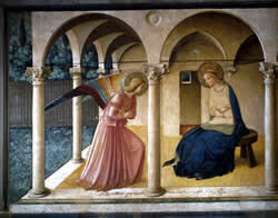
PART III-THE ANNUNCIATION
In the sixth month the angel Gabriel was sent by God to a town in Galilee called Nazareth, to a Virgin engaged to a man whose name was Joseph, of the house of David. The Virgin`s name was Mary. And he came to her and said, "Greetings, favored one! The Lord is with you." But she was much perplexed by his words and pondered what sort of greeting this might be. The angel said to her, "Do not be afraid, Mary, for you have favor with God. And now, you will conceive in your womb and bear a son, and you will name him Jesus. He will be great, and will be called the Son of the Most High, and the Lord God will give him the throne of his ancestor David. He will reign over the house of Jacob forever, and of his kingdom there will be no end." LUKE 1: 26-33

First, I will cede a mere modicum of divers postulations or anomalies, in order to give you better acumen as to my presence of mind. The story of the Annunciation is only told in the book of Luke, yet the portrayal of the Annunciation subject in art is ubiquitous for the timeframe discussed herein, the late Medieval and early Renaissance periods in Italy. Someone had a clear motive to propitiate the firmness of this account. Next, Fra Angelico was under the spell of a furious blast of winds, the zephyrs of Catholicism, truly blown by the Mendicant orders, the Franciscan and Benedictine, the latter of which he was a member. Expeditiously, Fra Angelico is in some measure Gothic, but at the same time, a practitioner of new ideas, accrued from the fresh insights of Masaccio! (Please note that Lorenzo Monaco was his chief mentor). Contemporary scholarship on Beato (Angel), exclusively for the recent Metropolitan exhibition, has been made ready by Laurence Kanter, the chief art historian for this prodigious panoply. Essential to ones collection is Fra Angelico by Laurence Kanter and Pia Palladino, and published by The Metropolitan Museum of Art, New York and Yale University Press, New Haven and London. The principium of this text, and sharply in opposition to John Pope-Hennessy from the old school, is that Kanter upholds Fra Angelico`s position as an deviceful artist, in the Florentive Quattrocento, conspicuously after the death of Masaccio in 1428, and before the advent of Fra Filippo Lippi. Foremost, when I experienced this exhibition on December 27, 2005, and without herein unveiling indulgent rhapsodies, I was bestruck with its perfection and fragrance of beauty, never played back in prior romps! Beato had such a saintly inspired and steady hand! So delicate was his application of paint-zealously, I scrutinized the surfaces of these antiquated panels-that one may imagine that the temper paint was applied with a needle, rather than a brush! So with these theories as an underpinning, I will begin to mull over sundry executions of the Annunciation.

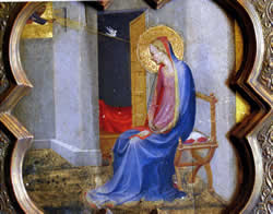
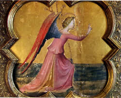
The earliest rendering of this subject by Fra Angelico was plausibly painted between 1413 and 1417 (see Laurence Kanter-pp. 22-24). It was done on two different panels, one as The Annunciatory Angel (11 3/8 x 12 ¼ in.) and one as The Virgin Annunciate (11 ¾ x 12 3/8 in.). In point of fact, I ogled these ethereal gems at the Metropolitan last December! Both are close models of Lorenzo Ghiberti`s bronze relief of the subject on the north door of the Baptistry in Florence. Even God the Father is shown in the top left hand corner of the Virgin piece with golden rays and the dove of the Holy Ghost. While the two medallion-like works are still primarily Gothic, the folds in the Virgin`s blue robes are true to nature. The wings of Gabriel are exquisitely articulated as he grasps a lily in his left hand. The Annunciation by Simone Martini painted some one-hundred years before, has a lily in Gabriel`s hand as well, yet it is the right hand. Angelico`s interpretation differs from Ghiberti`s in that the figures are discernible within the interior of the architectural structure. Throughout his tenure there is an apparent, increasing sculptural quality to his models-Donatello`s marbles and bronzes were very much an inspiration. The paint colors (tempera only) chosen are roses, blues, pinks, golds, and grays. Angelico employs bolder color choices than other artists from that time, with Lorenzo Monaco or Gentile da Fabriano as amenable guides. It is unknown what function the panels served, but they must have been part of a tabernacle or reliquary (Laurence Kanter-p. 23).
The two heavenly characters are also separated out in Giotto`s Annunciation, a most famous version in the Arena Chapel in Padua, painted around 1305, and not long after the chapel was built by its wealthy patron Scrovegni. Giotto`s Mary is matronly and more closely resembles an indigenous Italian of the Trecento. Angelico`s is to a greater extent innocent, perhaps younger, and more in tune with the other world. Duccio Buoninsegna`s Annunciation, in the National Gallery, London, and painted in Siena in the early Trecento, manifests a harbinger of modernity, with the central characters in motion, and a contemporary architectural backdrop. Duccio makes use of a lively application of color, and circumscribed command of the robes of Gabriel and Mary, in their shading and folds. Noteworthy too, are the mystical mastery of the vase of lilies and the descending dove of the Holy Spirit up in the arches. As to whether Fra Angelico ever saw Giotto or Duccio`s paintings, there is no surviving record, but it is believable that he did, when one examines his offerings.
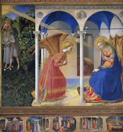
I choose to discuss the next three principal versions of the Annunciation by Fra Angelico in ascending order (from the base of the mountain to its pinnacle), according to my predilection for the paintings. The Annunciation at the Museo Nacional del Prado, Madrid (1425-1426) is one piece associated with Fra Angelico`s early-middle period; that is, when he was still under the spell of Lorenzo Ghiberti and Gentile da Fabriano. He is especially informed by Fabriano in his use of color and his penchant for meticulous design. Please study Gentile da Fabriano`s perception of the Annunciation. It does appear as if Fra utilized Fabriano`s streaming diagonal beam of golden light, radiating from God. The small altarpiece for San Domenico at Fiesole by Fra Angelico is wrought with detail; just look at the Garden of Eden drama unfolding to the left side of the panel, with Adam and Eve, an angel, and vivid verdure coupled with the bountiful fruits of paradise. Moreover, there is much painstaking accessary in the Archangel`s wings and his gilded rose-colored garments. The edifice, enveloping Gabriel and Mary, and highlighting the miracle with tans and whites, exudes mathematical precision and harmony. Profoundly, Angelico projects out of the Gothic references of Fabriano and his recent past, and into the scientific cadences of a Fillippo Brunelleschi or a Ghiberti. Conjointly, observe the subtle shading of the back chamber behind Our Lady-perhaps the boudoir of the Virgin herself! Curiously examine the swallow (rondine) perched on an iron tie rod to the left, and just above the Virgin-no doubt, a pun referring to the patron Allessandro Rondinelli (Laurence Kanter-p. 83).
The real space depiction of the figures in its architectural context, as well as their more pronounced genuflection (Kanter`s word), is a departure from Fabriano`s mostly rigid models and flat spatial frame of reference. Both of the blessed models are humbly stooped, and their hands are folded in sacrosanct devotion. Their faces are gentle, soft, and rosily irreproachable, and magnanimous gilded halos radiate about their heads! Too, the draperies behind the Virgin echo the gold/ochre of Gabriel`s wings, as do the deep blues of her robe parallel in tone the upper arches cascading down to the columns. The pinks of the Virgin`s undergarments are appreciably lighter than the Archangel`s, and subtly act as bookends to the smaller angel in the paradise scene to the left of the panel.
The Annunciation altarpiece from the church of San Domenico in Cortona (1430 or 1431) is emblematic of the late-middle period of Fra Angelico. This stylistic shift is outlined by a pruning of excessive elements, along with a sharper focus on the thematic developing drama within the painting (Laurence Kanter-p. 24). That is, considerable more tribute is paid to Masaccio, who died in 1428 in Rome. Some of the cornerstones of Masaccio`s revolutionary vicissitudes include: figures that appear more sculpture-like (inspiration from Donatello), the depiction of real space, as it appears to the naked eye in nature, the use of foreshortening, the employment of chiaroscuro, and lastly, the simplification of particular peripheral elements. Moreover, a most significant breakthrough of Masaccio, is the illustration of personages in histrionic motion or expression. I am proffering, as an example, the Expulsion from the Garden of Eden, in the Brancacci Chapel, which is within the church of Santa Maria del Carmine in Florence. And without the differentiating flagrancy of a bellowing braggadocio, I had the charmed occasion to visit this church in October of 2000, and could give testimony firsthand to the salient qualities of Masaccio`s revelations of technique.

With these new forms at his disposal, Fra Angelico begins to give birth to a number of compositions that betoken this new late-middle period style. In order to better grasp Beato`s newly acquired synthesis of the modus operandi of the one gifted Masaccio, I beseech you to look at The Apostle Saint James the Greater Freeing the Magician Hermogenes, painted in the late 1430s.This piece is in the permanent collection of the Kimbell Art Museum in Fort Worth-I shall make a point to feast my eyes on it with flagitous fanfare! Its creation coincides with a contiguous date to the Cortona Annunciation, as the figures also betray emotive action in their drawing. So then, as a result of the lessons gleaned from Masaccio, one may observe how much more motion is detectable in the Archangel and Mary of the Cortona piece, than in the Prado painting of about five or six years before. True also, the clothing reveals Masaccio`s influence notably, with the judicious use of chiaroscuro, and in the delineation of the folds of say, Mary`s blue robe or the rose skirt of Gabriel. One befuddlement, since his late-middle period is primarily associated with a bereavement of excessive ephemera, i.e. in apparent contradistinction-yet oddly the gilded wings of Gabriel are considerably embellished and thus distinguished from earlier productions, and the golden throne is almost Byzantine, with its geometric ornamentation! This can be made plain, perhaps, by the fact that these delicate touches give credence to the central drama of the calling up of Mary. As a consequence, they are not mere incidental minutiae that cast the eye away from the substrative vision, but contribute to the cardinal proceedings of the pictorial narrative-this too would be in deference to Masaccio!

By way of comparison, the Deposition, originally in the sacristy of the Santa Trinita of Florence, is in like manner from Angelico`s middle period (early 1430s), and is stylistically aligned to the Cortona Annunciation (Laurence Kanter-p. 87). Further, the components of the Deposition are realistic, as in the wood grain of the cross, the lash wounds on Christ, the cypress trees, the city of Jerusalem, and as a final embroidery, the indigenous Florentine attire of the saints and sinners (Laurence Kanter-p. 87). The Adoration of the Magi by Gentile da Fabriano, finished in 1423, and in the same church, provides sustenance for Beato`s panoramic depiction of Christ`s removal from the cross (Laurence Kanter-p. 87). Both paintings are distinguished by jewel-like precision and are fairy-tale portrayals of two unique biblical events, construed, in both cases, with much detachment.

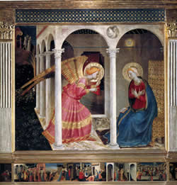
The last of Beato`s oeuvre that I will deliberate on, does emphatically bestow an optimum ravishment for my eyes, as do many of the frescoes from the Benedictine convent of San Marco in Florence. It is another Annunciation, painted in the 1440s, for the north corridor of the convent . The only other reference to the frescoes in San Marco that I can provide here, is Saint Dominic in Adoration before the Crucifix, that resides in the cloister of the convent, and is closest in style to the Annunciation. These two masterpieces, falling in the late years of his career, were painted by Beato only, as they reveal the hallmarks of his gentle hand. A considerable large quantity of these frescoes brandish the intervention of assistants (Laurence Kanter-pp. 184 and 185). This is primarily due to the fact that Fra Angelico depended on assistants to help him complete the considerable volume of work necessary to satisfy the demands of his patrons. Too, I am most fond of the fresco medium, and this contributes to my appreciation for this particular rendition. And another suggestion is the stark simplicity of this work, where ones eye is only focused on the blessed visitation of the Archangel Gabriel, as messenger, delivering the inevitable cosmic fate of the Virgin Mary.
Markedly, this painting is Masaccioesque-with the sweeping, agile genuflection of the models-they have body and presence, as they would in nature. Examine the Expulsion from Paradise to see how Masaccio captures Adam and Eve moving away in sorrow, after they have gravely disappointed their Maker! The stately edifice, in the San Marco fresco, is bathed in natural light, and this augments its religiosity and is proof of its simplicity; one can only see form in nature according to the conditions of light on that environment. This is a trait of Beato`s late phase, as he increasingly uses the effects of light on the models and the architecture; and this illumination as to the effects of light dictates his use of color, shading, and depth perception (Laurence Kanter-p. 184. note: some of this is my own idea). The cognition of the effects of light is an opulent divination for the Benedictine monk, as he more confidently grasps its true meaning!
As an opened-ended synopsis, I will just append some scant, yet canny inklings that visited my brain while I was partaking of my morn-peregrinations. First, and legitimately, Fra Angelico has not been given a befitting entitlement, as argued by Laurence Kanter, assuredly a preeminent authority on the subject of Beato. In some measure, the grounds for this are that the Dominican monk elevated or extended the revelations of Masaccio; this is principally a verity with regards to the three-dimensional depiction of models in real space. These factors include: motion, shading, and the use of light, utilized as rules or perhaps, as milestones, i.e. dictates, by which he could exactly position the lines and colors on the wood panel! The evidence that he put them in the exact befitting point and used the appropriate colors is, nothing short of a miracle! Next, Angelico`s creations are both religious and scientific at the same time-aye, most harmoniously balanced between these two zeitgeists! That is, he used traditional biblical stories, but projected them into the present with au courant buildings and people, and contempo clothing-yea, these outfits assume the quality of costumes to us today. Just to give proper credit, Giotto had initiated this trend in the early Trecento, then Gentile da Fabriano and others had upheld it. One clear aesthetic syndrome used by Beato is the idealization of models, such as the Virgin, Gabriel, and Jesus. And while others before him had inaugurated this, Beato did it most superbly, so the models appear as real saints-truly, they could reside in heaven itself! Lastly, the master Beato had the most graceful hand in the entire history of art-his central nevous system was wired to perfection; not even Leonardo had such a gentle touch!

Monday, February 6, 2006

GERHARD RICHTER

BRAVE NEW WORLD
February 16, 2006


I visited the Marian Goodman, at 24 West 57th, New York City, on two occasions-one on the 28th of December, and then again the next day, on the 29th.

I sat on the benches of the North Gallery (see my diagram) and studied the twelve Abstract Paintings-892 series (their actual titles). On the North wall there was one painted photograph with the title Mustangs Ed 131; the entire galleries of Marian Goodman are painted pure white, with only the paintings displayed. Each of the twelve works by Gerhard Richter-the 892 series-the newest of his oeuvre, and all painted in the spring of 2005, has the exact same dimensions, 77 3/8 x 52 inches (197 x 132 cm). All of them are oil paintings worked with a squeegee vigorously, in horizontal and vertical grids. The colors are varied from work to work, but they seem to function as a unit, one dependent on the other. The viewer can observe one, then another, and comparing them infinitely comes almost naturally!

892-5 is my favorite of the twelve Abstract Painting series. There is quite a bit of blue as patches in it. The squeegee has been worked up and down, and sideways. Streaks of green, red, pink, and yellow fleck the surface. Black bars partially separate the brighter tones, but the eye always returns to the blue patches. Some lighter streaks subdivide the surface in a horizontal fashion. I took a number of cell phone camera snaps of 892-5, and noticed how different the colors and patterns appeared when I compared them. I also compared them with the pristine prints in the exhibition catalog. I gazed at 892-5 from different angles, and the colors and patterns shimmered and mutated-an apparent optical illusion! The eye dances about the surface, and ones perception perpetually changes. It seems to vaguely mirror objects in nature, such as pond water, meadows, or chasms.

892-7 rests solely on the south wall of the North Gallery. A large arch bar dominates the surface. Another large arch occupies the left upper part of the canvas, in a kind of diagonal presentation. One other thick bar extends to the bottom, and is between the two arches. All of the large bar streaks appear as if the paint was manipulated with ones fingers, but maybe just a squeegee was employed. Patches of red in vertical motion run down the right side of the canvas, in grainy sporadic blotches! Light green and rainbow splotches project through the arch, light inflected! A deep vermillion or purple pulsates down the midsection of the canvas; the tones vibrate in grids down the canvas, and lighten or darken, according to how they hit your retina. With 892-7 it is as if you are pulling into St. Louis gazing from a riverboat on the mighty Mississippi!

This one comes very close to the most inspirational. 892-8 has a grainy, textured quality. The bottom left corner has some yellow/orange flourishes. There`s an undercurrent of green, especially on the whole right side. The tones are mostly combed in a horizontal direction. Some infrequent grey verticals create window panes to peer into. Rough layered textures of paint give it a depth and evasiveness. Some of the colors have run together and blend uniquely to form a profound deep purple. Sporadic patches of white free-up the eye to dwell on maroons and marbled-purples-and thus act as a ground. The eye searches toward the illusionary horizon for figures or the contours of landscape shapes, but all are phantasms of the eye. All strokes are purely abstract, but the viewer hallucinates form, yet nothing is there! Richter has a good sense of humor, but invents new vistas of painterly surface, new fodder for the eye, and Cartesian geometric patterns that that are a slap in the face for the philosophy of painting. Mainly by rejecting schools, isms, or rational platitudes, Richter approaches new unrealities that bath the eye of the bold and curious!

892-11 is more washed-out, atonal, and opaque. There is a preponderant white ground, as well as a sweeping horizontal fluidity. The left side has a few vertical, dark bars that lead the eye up and down; but mostly you`re swept sideways. There are sparse traces of red in the bottom left of the canvas. Again, new colors are created-mainly a light chartreuse or wistful lavender-almost colorless, white bars play throughout the surface-the gentle tones soothe and calm; your in a rainy Seattle morning. 892-11 is very complimentary to the louder works, such as 892-6. First you glance at a bright one, then you shift to a flat one, then you mellow out lightly. This seems to mirror nature. 892-11 is pinkish in tone, but it`s a contrived tone, and changes as you glance at another, then back to # 11. # 11 exudes placidity and would be a welcome friend on my condo wall. It could purge a body of stress in a nanosecond, bring peace of mind, free your soul to gentle, healing waters. 892-11 is the most transparent piece-the most feminine one too.

You will want to refer to the Marian Goodman web page frequently, because you can see the Gerhard Richter exhibition, that ran there from November 17th, 2005-January 14th, 2006-immaculately displayed, albeit your viewing is vicarious. The show in its entirety is archived under current exhibitions, but by the time you read this it may be under past exhibitions. Nonetheless, you should be able to get to it from the artists category. All three of the galleries are included, and this came in handy when my memory faltered, as to which works were in which gallery. You may want to peruse it carefully, then reread my piece, although I do have some pictorial aids included with my review.

The North Gallery viewing room is really just some side niches or panels in the front of the main gallery. 891-3, oil on linen, is much smaller than the 892s (40 3/16 x 28 1/3 inches), but is more amorphous, light green in tone, but streaked with blues, pinks, and olive. 891-4 is lighter with whites on the right, yellow in the top middle, and green on the bottom. It`s like your dreaming on a placid pond-very transcendental and hypnotic! 802-7 is a blue/grey dual play, with sharp horizontal lines that look like Venetian blinds.

This first rendering from the Middle Gallery, 892-11 may be misnumbered, as that number was used previously in the North Gallery. Maybe Richter was just dealing us a lark. This one is a diffused, flat grey/green one-looks like clouds. 889-1 is brighter with reds, ochres, and horizontal rainbow bars. It has a happier, musical feel. 891-1 Waldhaus is a painted photograph of verdure and mountains. 889-1 (2004) is dripping greens on a light ground. Again, these are early examples of where Richter`s painting experiments would go with the very fresh 2005 series. The surface isn`t as manipulated as the newer stuff; it looks like a bucket of green paint was nonchalantly tossed on this aluminum plate!

The silicates were in the South Gallery, and many of them are enormous. 885-1 Silicate is 114 1/6 x 114 1/6 inches, perfectly square. This is a painted photograph of a extremely blown-up molecule, and looks like honey-combed Nouveau Op Art. It toys with the eye creating titillating geometric patterns. 885-2 Silicate has a more horizontal flow to it; these silicates (or silly Kays) might suggest that every molecule in the universe is secretly a potential work of art! A mind-numbing phenomenon of nature! 885-3 Silicate looks like a gigantic air conditioning filter. Yea, I know this stuff is not suppose to resemble anything from our past-personal or collective memories!

As I write this I try to simulate the sort of free associations that Gerhard Richter utilizes. Your soul must remain a tabla rosa, then original feeling will spring forth as if from a natural fountain. A disregard for Art History is a golden rule, and free expression will be born by a systematic de-tethering from everything. I created my own little 892 series in my North Gallery diagram. They are not simulations of Richter, but free-flowing pastel applications. His 2005 series is pure painting, and must have been conceived in a robotic trance-purely in the now, with no interference from the past, present, or future. This is what Ad Reinhardt tried to do-painting is a separate dimension-not tied in with daily life or history. It would be interesting to apply that same principal to writing! This is Zen Buddhism-you tune into the paints and canvas-you use your muscles, arms, and fingers to apply materials to a medium, then an optimum, never-before-seen creation will be born. This is the only possible task, the only conceivable challenge! You create something out of nothing-then when you create another one, it is begot of the last-continuous, but a blatant new expression, a brave new world!

Monday, July 4, 2005

LBJ EXHIBIT-SIGN OF THE TIMES: LIFE IN THE SWINGIN` SIXTIES

July 4, 2005
FANTASMAGORICAL! ENCHANTING REANIMATIONS!-A VIRTUAL MAGIC CARPET RIDE-A TRIP BACK IN A TIME MACHINE! THE BLOODY REAL THING-A MIDWAY RIDE SO NAMED: THE SPIRIT OF ROCK AND ROLL!
EVERYTHING IS POPPIN` UP DAISIES!
MUSINGS ON THE LBJ EXHIBIT-SIGN OF THE TIMES: LIFE IN THE SWINGIN` SIXTIES.

Sign Of The Times: Life In The Swingin` Sixties will run at the LBJ Library until September 5th. If you have forgotten many of the people and ephemera, this exhibit will bring them back in magnificent clarity. I lived in Houston, Texas (1959-1965) in the first half of the sixties, and in Dallas, Texas (1965-1969) the second half of the sixties. The whole time was charged with creativity and discovery, for me, but with struggle comes some pain. I seemed to reinvent myself daily in those days; I changed my priorities from sports to music. Strong forces seemed to seduce me over the line. This particular show focuses just on the aesthetic angle of the sixties. LBJ had established the National Endowment for the Arts and Humanities, as part of his Great Society plan, and it enhanced the arts throughout the nation. Even the Public Broadcasting Corporation ( PBS ) was a sibling of the Great Society. This exhibit does not touch on Vietnam, Civil Rights, assassinations, or class warfare. Those albatrosses remain in the back of your mind, but rather the show provides you with plentiful examples of the music, art, film, TV, and fashion from this era of zest.


LBJ`s Great Society promised much, and in essence, delivered much. Creativity abounded; no dearth of heroes existed-the times were all about POP ! The heroes that populate those times embody this notion. So load up your astro-bright Volkswagen bus with urchins and revisit the cutely, cobwebbed Summer of Love. Oh yea mate, everything is poppin` up daisies!


BRITISH INVASION
As you enter the exhibit, opaque black and white wallpaper pics of many of the British Invasion bands plaster the walls. Familiar tunes waft from the speakers: “Glad All Over” “Twist and Shout”, and “There`s A Place”. And to think that at one time, The Dave Clark Five competed neck-to-neck with The Fab Four, for the crown, king of the rockers. Rare footage of The Beatles plays on the wall, from their 1964 worldwind tour of the USA. Paul tosses clothes in a suitcase, Ringo and John mock the camera, and George too, defiantly grimaces at the lens, Also, on a gigantic screen, caged go-go-girls ( go-go-boots-yea ) dance kinetically to the Brit pop! Haven`t seen the Froog, Twist, Mashed Potato, or Watusi in lightyears. The Animals, Hermit`s Hermits, Gerry and The Pacemakers, and even The Hollies, all electrified our daily lives-in the wink of an eye. Hey, Dave Clark is a versatile chap, and a successful businessman. Early on he bought the rights to The Ready Steady Go! series, and has been racking up royalties for a good while!


GEAR FASHION
It is sheer bliss to see all of these fashion-plates again; many of the celebrated wearables are here: bell bottoms, a Nehru jacket, wire-rimmed glasses, and an electric shirt, all displayed as if one is peering through a boutique window ! A video monitor runs Carnaby Street footage and there is Twiggy walking the rug once again. Even some jewelry of Kenneth Lane can be viewed. Mary Quaint was the inventor of the mini-skirt, the optimum wear for liberated girls.


TV ROOM
“Winston tastes good like a…cigarette should.” The TV Room is set up just as many folks had there dens in the 1960s. The LP vinyl albums are in a metal rack near an old timey hi-fi-console, with an adjacent cone-tree-lamp-perceived as modern furniture! The RCA Victor plays many of those vintage commercials, and a night stand has a stack of Life, Popular Mechanic, and Mad magazines.


CUTTING EDGE COMEDY
This space has been set up like a little bare-bones Stand-up Comedy Club, and has a TV monitor running old Bill Cosby and Woody Allen routines. Suddenly, there was much risk-taking in comedy; jabbing at society and everything was subject to ridicule-race, sex, politics, The War! What`s cool is the stark simple staging- with just comedian, audience, and a pocketful of jibes!


TELEVISION
This section is broken up into various kiosks, that represent sundry program categories. There is Cool Camp; Gilligan`s Island, Mr. Ed, Batman, The Dating Game, and The Munsters-Breakthroughs; with Laugh-In, Star Trek, That Girl, and The Smother`s Brothers- AndCool Cops, Cool Spies; The Avengers, The Mod Squad, I Spy, and U.N.C.L.E. Oh, one other that I forgot to note, but it had comedy sitcoms such as: I Dream of Jeannie, Bewitched, and The Beverly Hillbillies. You could turn on one of these shows and listen with headphones, but you could get bogged down, and bend your precious time, if you loitered latently at this locale! Here is an interesting site that has all the dribble that never made it big. Diana Rigg had me sweating sweet boy bullets with a rapturous, adolescent crush-delightful daydream dalliance though. All of these shows are massively imprinted on my cerebral cortex, and can be rerun with a wave of the wand to the telepathic television monitor in my mind.


BLACK MUSIC
The highlight of this section is the display of the Supremes` sequined butterfly dresses! There are also many black and white glossies of icons such as: Isaac Hays, James Brown, Rufus Thomas, and Ike and Tina Turner. It is a significant accomplishment that so many breakthroughs occurred in Black music. There is a nice photo of the Motown house, Hitsville USA and glossies of The Temptations, Stevie Wonder, and The Four Tops. Powerful items indeed, were two pieces of sheet music: “I Hear a Symphony” and “You Keep Me Hangin` On”, both Holland-Dozier-Holland compositions. The only version I recall of the latter is Vanilla Fudge`s riveting rendition-an early suggestion of rock opera.


SPORTS
The sports area covered many of the larger-than-life figures, like “Broadway Joe,” arguably the greatest NFL quarterback ever, led the Jets to victory over the Colts in Super Bowl III-1/12/1969. Denny Laine, only foggily recalled, was a thirty game winner, pitching for the Detriot Tigers in 1968. He will be remembered mainly as an organ player, then for illegal gambling, fraud, and his lengthy jail sentences! Mohammed Ali is not only the greatest all time boxer, but also a champion for African American rights, as well as an outspoken critic of the Vietnam War.


GARAGE BANDS
The diorama of this life-size rock combo, complete with Marshal amps, Ludwig drums, and mop-topped kids, accurately simulates the garage band craze of the 1960s. The dreams of many kids were processed through iconic pop music stars; role models from sports were freely jettisoned! Free-form bands popped up on every suburban street corner.


PSYCHEDELIC SCENE
As one drifts into the psychedelic section, representing the crowning years of the 1960s (67,68, & 69), the Moody Blues` anthem Legends of a Mind plays: “Timothy Leary`s dead, no no he`s outside, looking in!” A light show is projected on the wall, as in oil and colors swirling on an overhead projector, and it twitters with strobes, rewinding you to that electric time. Timothy Leary`s primer, The Psychedelic Experience , is mounted on the wall at eye-view. There also, is the first Rolling Stone magazine, with a publishing date of November 9, 1967. A striking photo of John Lennon, from the movie How I Won The War, is on that original cover.


POSTER SCENE
This section has perhaps a more indigenous cross section of items ! Austin produced an amazing poster scene! That is becoming increasingly apparent. I recommend that you read, “The Maverick Tradition: Postering in Austin, Texas” by Nels Jacobson. A real spiritual beeline was established between San Francisco and Austin. The Avalon Ballroom, in San Francisco, provided the inspiration for quality poster and flyer art. In Austin, especially, the posters of Gilbert Shelton and Jim Franklin are tantalizing targets for collectors! Many of these were created in cahoots with the Vulcan Gas Co., 316 Congress Avenue. They grow in value as more people intuit their historical importance. Especially some of the posters verily simulate the psychedelic experience by way of the visual senses, with astro-bright colors and surreal images. The posters also help to document the music scene, with local bands such as the Conqueroos and The Thirteenth Floor Elevators, and legendary touring marvels, Moby Grape, The Fugs, and The Velvet Underground. I could “turn on, tune in, and drop out” quite aptly in this section! I morphed once again to a flamboyant flower child for just a dash.


WRITERS
I was so inspired by this section, that I went out and bought Armies of the Night by Norman Mailer, and devoured it in a jiffy. It documents the march against the Pentagon by war protestors, on October 21, 1967, and is a full rave against the U.S.`increased commitment in Vietnam. Arguments for and against the war are provided, just in case you are hazy on it, after forty years.Armies won a Pulitzer prize, and used the literary device of history as literature, then literature as history. Do not forget Kurt Vonnegut`s Slaughterhouse Five; an odd blend of science fiction and some painful recollections of the Allies` bombing of Dresden in WWII. Tom Wolfe has a grab bag of insight into the far side of the American Experience, as The Electric Kool-Aid Acid Test chronicles the zany deeds of Ken Kesey and The Merry Pranksters. Also on display were Little Big Man by Thomas Berger, and Portney`s Complaint by Philip Roth. I never read the last two, but appeciated the movie, Little Big Man, with Dustin Hoffman. Truman Capote invented the genre of True Crime, and In Cold Blood has been thoroughly perused by yours truly.


POP ART
It emerged with meteoric spontaneity and freshness in the 1960s! Not very far from my side, for more than twenty years, a copy of Pop Art , edited by Lucy R. Lippard, has instructed me, and you would be wise to procure a copy for yourself. As I entered the Pop Art section I first saw a photo of LBJ and J. William Fulbright studying a piece of Op Art. They are unlikely advocates of this new art! Then I saw a photo of Yoko Ono bedecked in tattered rags, at her show Cut Pieces, from 1962-in fine form. People could come up and cut off a piece of her clothing; this is an early example of performance art.


Behind glass some works of the greatest pop-artists were displayed. One of Warhol`s silkscreens of Marilyn quickly comes into focus! These icons of starlets fetch a pretty penny these days. In fact, a silkscreen of Liz Taylor brought in 12.6 million at a Christie`s auction recently. One still has to scratch their head in marvel at the commanding pittance of these Warhols! Robert Rauschenberg experimented with the collage technique and multi-media, including photographs, utilized in many ways. Current events and history were interpreted effectively through the arrangement of images in a collage. Roy Lichtenstein would take an ad from a Sunday New York Times, isolate the girl from the ad, then greatly enlarge her- in this case to 60 ½ inches x 36 ½ inches. Just look at the gargantuan Girl With A Ball ; its billboard simplicity is striking, and sticks with you for eons of hour glass 180s. Jasper John`s flags and U.S. maps strike a chord with ones national sensibilities. Maybe his emblematic projections gave fodder to the rapacious rave for flag clothing and red, white, and blue rolling papers, that permeated the Woodstock Generation.


Included near to the end, was one piece by Larry Rivers, Dead Veteran; he too would take advertising ads, such as the Camel cigarette logo, slightly alter it, and replicate it on the canvas. The final piece in this section was Toulouse Lautrec by Peter Max. He is the consummate, quintessential, iconic representative of the 1960s; I know that I had many of his posters on my bedroom wall! I am currently looking for the Life Magazine of September 5, 1969 with Peter Max on the cover; a horded keepsake, I am mostly sure!


MOVIES
A Hard Days Night was included in the film section, and brought back the memory of taking the bus to downtown Houston with some elementary school friends, and feeling like we were a part of the event of the century. The songs were perfect and the black and white film gave it a documentary touch. All the Beatles were good, but Ringo walking along the river with an instrumental of “This Boy” was the mountaintop moment of the film.


Dr. Strangelove and 2001 A Space Odyssey are both Stanley Kubrick films, both are masterpieces, and sometimes I suspect that he is my favorite film-maker. I saw A Clockwork Orange at the Paramount a couple of summers ago, and I hadn`t seen it since 1971; I was riveted with the satire and wit. I worked as an usher at Northtown Six Theaters in Dallas in the late sixties, and saw Space Odyssey , maybe a thousand times. Its theme is the entire timeline of man, but modeled as circular rather than linear; ie history repeats itself continuously; it makes no difference if you reside in prehistoric times, or modernity. This was the theme that I was able to glean from Odyssey. Time matches Einstein`s Theory of Relativity, and the cosmic presence of the film moves freely about the past, present, and future! Dr. Strangelove is an anti-war film where comedy is a transparent veil for the sinister machinations of the Cold War, and the ease of atomic mishap, at the hands of berserko military generals.


Mike Nichol`s The Graduate best expressed the newly emerging phenomenon of the “Generation Gap”. Adultery, love, career, suburban sensibility, and youthful idealism are touched on artfully. The Simon and Garfunkel songs magnanimously compliment the film timbre, and Dustin Hoffman, Katherine Ross, and Anne Bancroft all emerged as superstars! Mike Nichols is recently back on top of his form, with Angels Over America and Closer. It is wise to review his filmography in order to realize how many really great films he has made.


In The Heat of the Night, directed by Norman Jewison, has a challenging who done it plot, and touched on racial issues in the deep south. Rod Steiger is fantastic and Sidney Poitier created a franchise playing Virgil Tibbs. Racial issues were finally out in the open in the 1960s.


There are also many other good choices for the very best films of the decade, such as Psycho, Bonnie and Clyde, or Woodstock. But one would best not be back-peddling `bout such enumerating trite.


CONCLUSION
So there it is, hope you had a pleasant journey! Not too much jet lag, or that bad brown acid that may still be going around! The best thing to do is to follow a more specific yellow brick road , and to bone-up on topics germane to this exhibit, that best accommodate your indulgences. This summer the Tate Liverpool is having a similar show, but naturally it covers the European connection to the arts in the sixties. Hope your dreams are not too clouded with musty, poisonous mushrooms and that everything is poppin` up daisies!